Author Thread Comments Made During the Challenge
Post actions
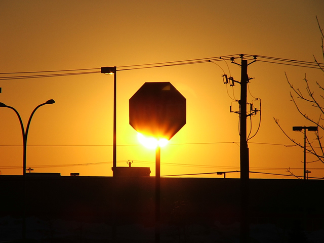
I think this may have worked better if the light was totally hidden behind the sign.
Post actions
Love the colour. I would, however, prefer to see more sky and less ground at the bottom of the picture.
Post actions
I keep coming back to this one. Great originality, and good colors. Be careful when you do this kind of photography. (you probably know) It's tough on your eyes. Take care!
Post actions
This is a good picture. I'd like it more if there was more focus on the sign. The poles seem to distract.
Post actions
Post actions
Even though the background is not much to look at the picture as a whole works well together. Nice job
Post actions
Looks like flames on the sign. Well done.
Post actions
Post actions
Post actions
the sign is great, the rest is distraction to me. I would like to see this cropped right down to the sign
Post actions
This would be ribbon worthy if it didnt have so many distracting elements to the picture. It may have even been okay if just the didnt have the light posts.





 Add photograph to your favorites
 Add photographer to your favorites


 Photographer found comment helpful.


