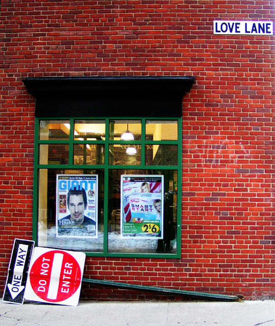
Congrats on your PB. Although I missed voting on this challenge, this image would have scored quite well with me. The irony you captured and the complimentary processing choices you made work very well together. My only (very slight) nit is that the extreme upper right has a bit of a glare - probably from a street light. But... Nice job!
I like this whimsy of this and the bright, crisp colors. The off-centered composition and how the colors really make the subjects pop give this shot a pleasing route for the eye to follow. 8
One of those pictures which I like very much without being able to tell why. Last time I had that problem with a picture it ribboned. Maybe the same will happen to you. I give you a 10.
The window and posters are a distraction. The flare in the upper right detracts slightly from the image. The position of the "one way" sign is very good and certainly does remind me of a "down and out" person. I just find my eye leading to the face of Ethan Hawke, then to the "Do Not Enter" sign, then I just wander from there.
interesting shot but really huge on my screen. The light source shinning on the LOVE LANE sign is a little to much. Other then that it has excellent contrast, color and clarity. The reflection from the store window is very distracting as well. Good luck in this challenge.





 Add photograph to your favorites
 Add photographer to your favorites

 Photographer found comment helpful.


