Thanks for the comments. I learned alot from this one picture, and look forward to taking more pictures. :-)
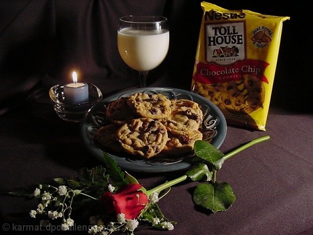
To address some of the general comments: 1) Yes, it was a touch dark on the left side. I know now how to lighten that up. However, I did want a "dark, romantic" mood. Maybe just more uniform darkness. 2) Elegance and romance really don't go with chocolate chip cookies and milk. That was exactly why I did that. I was hoping the juxtaposition of the elements would catch attention.
Anyway, it was a fun picture to eat, I mean take, and in looking at it again, I think I have some more in the fridge I can bake up real fast. Thanks again!
Mmmmm... chocolate! I think I would have moved the cookie bag to the other side of the composition. As it is now, the side of the bag is lit, and the front is shadowed.
good idea, need help inseveral areas, better composition (too much going on, try it with just the milk the cookies and the bag), better lighting (more light on the product.
Nice setup. You obviously took time to do this. I think I would have moved the rose more to the left about 5 inches to balance things a bit more and not be so centered with the cookies. This voting is making me hungry.
ah yes, tollhouse cookies, milk, and Romance. ; ) creative, ill give it that. recommend a reflector on the left side to fill in the shadows over there a bit. even a piece of white posterboard or a piece of white paper would do it. move it in as close as you can without it being in the scene.
The lighting in the picture seems to draw attention away from the cookies being advertised. Perhaps if the milk and the cookies had been switched (or the light source were on the other side) the cookies might have been more noticeable.
Not enough light on the product name - maybe if you switched the candle and the package it'd be easier to read it. What a great romantic dinner, though!
Super photo. Very inviting late night snack. The only flaw to my eye is the reflection on the upper right of the glass. I realize how tough it is to shoot reflective surfaces. I rate this photo a 10 nontheless. Keep up the good work.
Nice set up, but a little too dark around the cookies and packaging for my liking. It makes the milk stand out too much and take away from the actual product
Very nice. The lighting is a bit off for my taste however. not enough detail on the package face. Enhacing the light from the left ot give the candle a warmer glow to cover the scene would have been nice to me. Very well done though.
The rose and candy represent the love that the cookies were baked with. The candle does not shed quite enough light on the brand name of product but I think this is good.
I really like this composition. It has a nice touch of confections and romance all rolled into one. I think an additional glass of milk would have really topped off this already excellent photo...
The darkness fits the mood, but the light flooding in from the right is a little awkard. I think a dimly lit overhead light would've worked out better.
I take great pride in baking my own cookies but you sold me! I'm not sure if the candle is needed in this story. imo the lighting show be increased. Maybe just a little soft light on the left side? Great photo. I want a cookie.
Good image. I like the lighting but I would have switched the candle and the package of cookies so that the packakage has more direct light and therefore is more readable. With the current setup its difficult to read the package.





 Add photograph to your favorites
 Add photographer to your favorites


 Photographer found comment helpful.


