Author Thread
Post actions
I did'nt realize I made a spelling error in the title, oh well. thanks for all of the helpful comments. I'm new at this and i'll take all of the constructive critisism i can get
Comments Made During the Challenge
Post actions
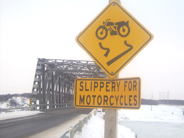
might have suggested playing up the fact that the sign looks very facelike, and avoid the repetition of the sign text in the image title.
Post actions
Your photo needs more contrast, that yellow could have more punch to it. Was the spelling mistake deliberate?
Post actions
The sign looks a little washed out, unfortunately.
Post actions
I think the ice is a dead giveaway. LOL... The image is over-exposed: the light areas are entirely white, and the shadow areas are not dark enough. You can't fix the whites, but either levels or curves can help the shadows.
Post actions
Nice sign, but the photo is a little too washed out for my tastes.
Post actions
Post actions
This photo has a good frame to it, but would be even better if you had a peson in the background riding a motorcycle.
Post actions
Maybe a black and white would help with what I am assuming was a fog issue. 7
Post actions
IT IS TOO BRIGHT....BUT THE SIGN IS VERY UNIQUE
Post actions





 Add photograph to your favorites
 Add photographer to your favorites


 Photographer found comment helpful.


