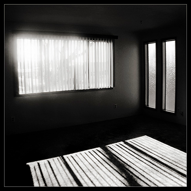
I know this won't appeal to most, but there's something about this picture that I just find pleasing. This was actually a picture gone wrong that I had taken while looking at houses for sale.. I left the camera on auto, and it didn't always work out well. However, when I got home and tweaked it a little in PS, it turned out to be a nice study of shadow and light. I know I'll get flack about the noise, but I really like noise in some b&ws, and this is one of them. I really liked the original colour version, too, but decided on b&w for the drama of it. That, and the colours of the house were such that it looked as if I had the white balance set wrong. ;)
Editing: Curves, hue/saturation, cropped, resized, border. I may have done a little dodge/burn; can't remember if I got rid of it all or just faded it.
Statistics
Place: 149 out of 266 Avg (all users): 5.3033 Avg (commenters): 7.4000 Avg (participants): 5.2162 Avg (non-participants): 5.4000 Views since voting: 874 Views during voting: 292 Votes: 211 Comments: 12 Favorites: 2 (view)
Hm. I had something along the same lines myself, but didn't upload it. Compositionally this is very strong, and there is a sense of atmosphere to the empty room. I think you've done a good job wiith the balance of exposure, in a near imposible situation, without taking obvious processing artefacts to a noticeable amount. The impression of haze around the window, the unevenness of it, bugs me just a little: I like the idea of it, but the non-regularity of it somehow makes it seem unsuited to the room, unnatural, almost, out of place. Unless of course that is a processing artefact :-)
There is something very gloomy and foreboding about this picture. Excellent potential, but it may have been a little more interesting with something in the room.. maybe a lone chair?
What a fantastic idea. What would have really worked better is if there was something more interesting immediately ouside the window, casting a shadow into the room. Still, this is a nice, clean, graphic composition. Well done, 8





 Add photograph to your favorites
 Add photographer to your favorites

 Photographer found comment helpful.


