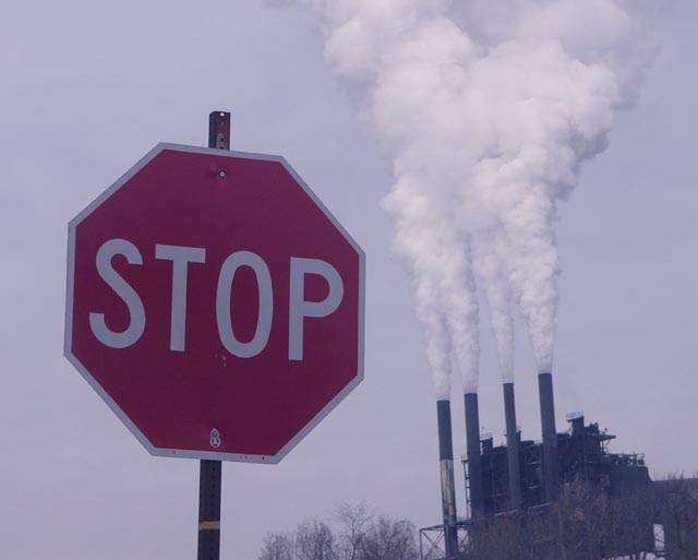
An excellently composed and concieved image spoiled by very bad white balance and an excess of exclamation points. A little work in a graphics package to correct the white balance, lighten and increase contrast would hugely improve this image. This would be a 9 once edited. For now it's a 7.
Neat composition, but looks like it could use some work in photoshop. Colours just don't pop, playing with curves and saturation would help. Might even be good in B&W.
To me, neither the sign nor the chimneys are vertical, so they seem to be falling together. If the photo were to be rotated,so thay the chimneys were vertical, then the sign would seem to lean towards the chimneys as if to ram its message home. It would also be good if you could give the sign a saturation boost to give it a little more punch.
I like how the smoke almost acts as exclamation marks next to the sign! Not a fan of the cloudy cast over the whole image. Adds a real mucky and flat feel. Nice job creatively though.





 Add photograph to your favorites
 Add photographer to your favorites


 Photographer found comment helpful.


