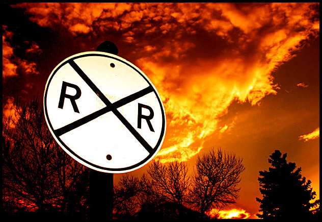
Cool colour and composition. The signs is a little too bright for my taste, but at least it really stands out against the baclground. On second thought, it's fine. 8.
Revisit. Bumping to 10.
Wow, Looks just like it did the day my house burnt down... Well done.. youmade my heart skip a beat... Wow.. this shot grabbed me and tipped me upside down...
Revisited: By far my favourite shot... Well done.. Top marks.
hi, your sige is very interesting. you can take a good shot with fill-flash. but your pic have one probrem.why your pic have a little blur ( the little-upper-right ). but overall is ok. sorry for my english. nice to meet you. thank a lot
I know this is the theme of the challenge, to take a picture of a road sign but here I feel that you took a picture of a beautiful sunset and that stupid sign is in the way and I think it should be the other way around, the sign be the main subject and the backround just that, a backround.
Anyway don´t get me wrong, it´s still a good shot and one of the better in the challenge so I gave it a 7. The sunset itself in another challenge like a free study and withouth the sign I would have probably given 9 or a 10, it looks stunning.
Shame you couldn't dodge out the sign to get the yellow back in the RR sign. I'lll bet the fully edited shot is amazing; never the less this is a beautifull shot8
wow....this is by far my favorite photograph of the challenge....the composition is excellent, the placing of the sign, everything about it is great!
Not to mention the beautiful deep shades of red and sillhouetted trees in the foreground....amazing.....a 10!!!
I'm predicting this will be one of the top 3...
From the looks of the sign, you must have used a direct fill flash. Even if its diffused, any direct flash on a sign like that is going to cause the sign to burn up and become white because the light goes straight back into the lens, it's just like red eye, only in this case its with a sign. I'd suggest unmounting your flash and maybe lighting the sign from an extreme angle, so long as the light doesn't go straight back into the lens, you should be ok, or at least better off. Over all, I like this photo, but it would be even better if the sign hadn't burned up so badly. Nice job with the frame.
I like the way everything but the sign is silhouetted and how vibrant the RR sign is but whith such a high contrast I find it very hard to look at. I also find that there is something in the middle of the sign that is very distracting. Great color and clarity and awesome silohouettes. well done and keep up the good work. <7>





 The Flagrant Crossing
 Add photograph to your favorites
 Add photographer to your favorites

 Photographer found comment helpful.


