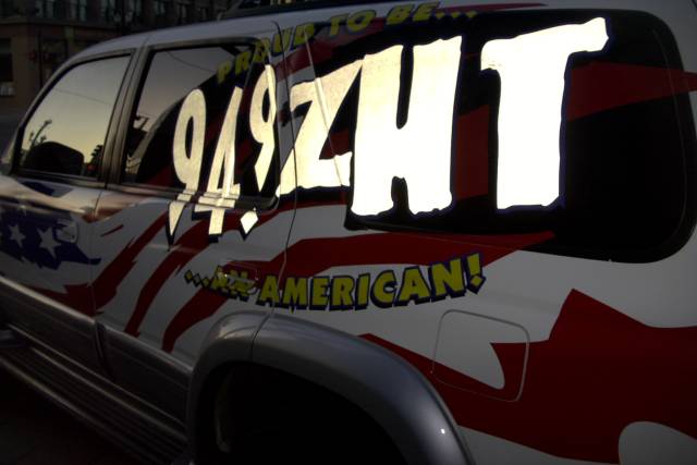
I really like how the "94.9 ZHT" pops off the vehiclee but I think it came at too much an expense to the rest of the writing. The "Proud...." just gets lost in the darkness. Could you have moved the vehicle to get better lighting? I like the reflection of trees and sky in the windows but not the power lines.
Not sure if a flash was used on this one but it lookts a bit over saturated / expeposed at the tail end of the letters. The concept of advertisement is there.
The way the flash worked on the lettering is interesting, a little, and there's a bit of sunrise or sunset reflected in the window (albeit with utility lines and poles). Don't see much else to recommend this, though.
Not sure that you created this from your imagination but it lacks interest. I am not drawn to it but I would rather not listen this station based upon this picture. You did use good use of lighting to make it scale dak to light. That I do like
I like this picture. The radio station logo stands out really well, but the rest of the image is slightly dark...but at the same time, it brings out the logo very well..
Good photo, those letters realy do stand out against the rest of the photo (the HT is almost too white though). I would've expected something different than a shot of an advertisement for this challenge.
very cool shot.. this works mainly b/c the white letters catch the light and stand out.. cool effect. but then looking closer I see that the lighting was kinda bad.. so this one is iffy for me.






 Add photograph to your favorites
 Add photographer to your favorites


