i imagine one could come up with somekind of symbolic significances about this view, but i mainly tried to produce a good shot on roadsigns i guess
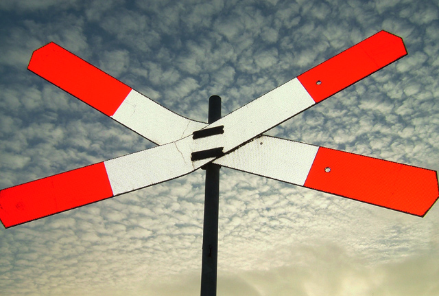
the bright colours come from an extended fill-in flash on the reflector-like surface of the Andreas-cross (not sure if that is a common name)
might be an interesting detail the clouds are exactly 50 ( at least the way i count them)
i did my lightmetering on the clouds for the best results in this part and used the fill-in flash for the object being the cross and it gives a nice contrast like this i think
my first title for this was 'American/Dutch Connection' for we have the same colours in our flag but a friend of mine came up with this one and i really liked it much more in the end (we're both huge fans of Neil Young since we can remember maybe that explains)
Statistics
Place: 81 out of 292 Avg (all users): 5.6162 Avg (commenters): 7.1250 Avg (participants): 5.6410 Avg (non-participants): 5.5974 Views since voting: 966 Views during voting: 360 Votes: 271 Comments: 8 Favorites: 0
I think that perhaps the fill flash is a little overdone, but there is a nice contrast between the simplicity of the lines of the sign and the complexity of the clouds. I'm not sure about cropping the bottom left of the sign, though.
As a pure graphic this is one of the best in the challenge, I wish you hadn't squeezed the sign so much that the arms ran off the page, but the forms and colors are very strong.





 Add photograph to your favorites
 Add photographer to your favorites


 Photographer found comment helpful.


