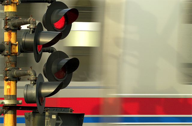
Beautiful colors! The wide, beigey vertical line (where the cars are joined, I'm guessing) detracts a little in my mind, but that's probably just picky of me to say. The way the traffic lights and post stand out is outstanding.
Kind of like this. I can see your choice in cincludding the shadow, but I think you've pushed the structure of the lights and their pole too far out of frame in order to include it, and cropped some of the other fittings on the pole - not suggesting that you include every light on the stand, but I think moving the pole into a stronger plane in the image would make it feel less releated - and the colour, the rust, the texture there, set against the moving train, would be rather fine, i think.







 Add photograph to your favorites
 Add photographer to your favorites


 Photographer found comment helpful.


