Author Thread Comments Made During the Challenge
Post actions
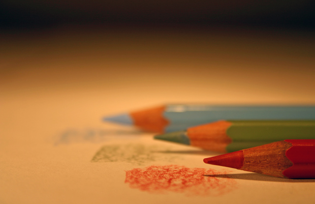
Good idea of the usage of the items. Unfortunatly, the colours displayed (especially from the paper) doesnt bring closure to the colour selection (bad palette). Also the darker tones of the upper part of the picture screams for a crop, as it just makes the picture more dull to look at. 5.
Post actions
Simple but to the point (no pun intended). I really like the way you fade to black in the background. Very nice.
Post actions
Post actions
I like the pool of light and the shadow behind' but it is just too yellow a light to show off the colors.
Post actions
excellent idea, good DOF, and very good composition. 7
Post actions
The black on top throws me off.
Post actions
The image could be sharper. (4)
Post actions
I would have used more depth to put blue more in focus. Not affecting the score, but I would always consider yellow to be more "basic" than green.
Post actions






 Add photograph to your favorites
 Add photographer to your favorites


 Photographer found comment helpful.


