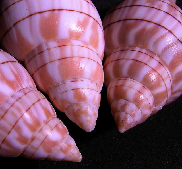
Good idea, very weak lighting. Also the black background is not very clean and gives out too much. A frame could help in tighting slightly. (Perharps trying to remove some magena saturation could punch the shells a bit, removing some of the purple...). 5.
Nice tones and repeating structure. I wish you'd have been able to include more of the third one to make all the darker rings of the shells go round the entire image area. Compositionally there's no hint for the eye, what's the message or where's the point besides nice colors and texture. Even more diffused light would have suited this image better.
Great colors. Two suggestions: (1) try a softer light source to avoid glaring bright spots. (2) notice where all the lines point... down and out of the image. it might have worked better to have the three points converging somewhere in the middle parts of the image.






 Add photograph to your favorites
 Add photographer to your favorites


 Photographer found comment helpful.


