i see washed out images in advertising and magazine article images all the time -- as in this case washout didn't harm the photo (or product) at all, you did a GREAT job!! Congrats!
I'm shocked to say the least that this took third. I agree the flowers were washed out and I wasn't entirely happy with the image. Glad everyone enjoyed it!
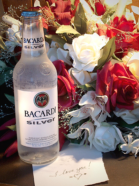
The flowers provide the perfect background for this shot. The lighting is just a bit harsh on the white rose. Was this sunlight coming through a window? The frostiness of the bottle adds a good dimension to the feel of this. NIce capture!
The slight tip to the left is destracting We are allowed to rotate in photoshop, and you can do partial degrees this is like a 1 or 1.5 clockwise and it woud be execelent..
You did a lot right here. The lighting on the bottle is very slick and professional, and the note and flowers add story to the image. Using a cold bottle for condensation was good thinking, too. On the downside, the flowers go from underlit at the bottom to overexposed at the top, the whole needs some CW rotation, and the idea of screwcap malt liquor as an anniversary present probably won't fly with the missus. Kind of wonder about the two torn and one cut edges on the note, as well. Tough call. What's good is very good, but there are elements that detract in a big (to me) way.
its not wine... flowers look too fake and i don't have emotional attachment to this product. a dry bottle would have worked better and not get water on your note distracting.
Frosting the bottle is a nice touch. I think I'd be nice to have a little more light on the bottle and a little less on the flowers. The background at the upper left and the table edge at the lower left are a little distracting. The note is cute!
very nicely done, i like that you frosted the bottle, so essential in illustrating cool and wet, the only improvements i'd like to see would be that the bottle befully vertical with label facing out and that the hotspot in the flowers be toned down just a bit. great work!! nice concept well esecuted!
gGreat shot! The condensation on the bottle shows through nicely. I love the use of light - the flowers are nice touch. (It would have been nice if they were real, but that would have been expensive!!!!!!!) I still give you a high rating. Great job!
The table picks up the color of the leaves, the flowers complement the frostiness of the bottle. The red accents the red on the label. The note is absolutely inspired! Good job!
A great composition. I think I would have cropped to get rid of the distraction at the bottom left. Wonder how many said that the bottle was slanted? I think you planned it that way. One of the better ones to me.
Excellent composition. Love the concept. Especially like how the bottle is light against the shawdows caused by the flowers behind it. The note is a great touch.
this is beautiful. one of the best pics in the challenge. i think though i would have tried to adjust white balance so that the light to the right isnt so yellowish.
great idea--bet bacardi will be mad they didn't think of it! maybe just a little tighter cropping on the bottom-- you get a 9! (even though that stuff is heinous!:)
I think this is my favorite in this challenge. i dont like bacardi silver but I LOVE this photo... The only improvement that may or may not have been possible here is to equalize the lighting temperature across the entire photo. in the upper right corner, the lighting has a more yellow tint to it than in the rest of the shot. Very nice concept here!!
Great photo, good advert, maybe a little sweat beading on the glass would have been nice. Also, on your lighting....it may have been a little harsh. On my screen the white rose in the upper middle is almost washed out. Tech 8 Advert 9 - total 9






 Silver Anniversary
 Add photograph to your favorites
 Add photographer to your favorites


