Sorry... I don't believe that this effect should be legal in the competitions and must vote to discourage it's use...
TC
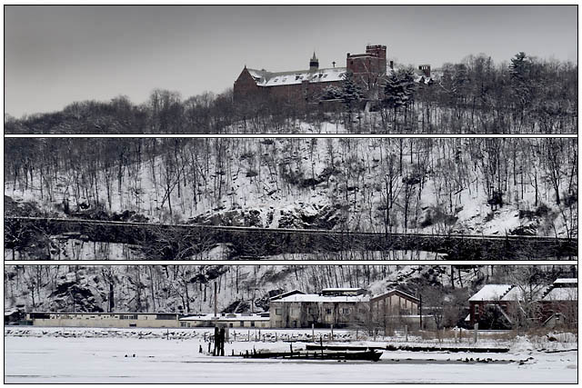
Edited to add actual critique: I'm not sure why you chose to use the tryptych style in this image. There really is no connection to the challenge theme except that you have divided the shot into three sections. You have what is essentially an average landscape type of shot which incorporates some urban elements. By adding the horizontal bars you have not added anything to the composition. If anything you have divided the shot into a very nice panoramic style shot (top), a below average (spelled boring) urban shot (bottom), and a very bland landscape in the middle. You really didn't add any impact or pop to the shot...
I get the frame idea, which is quite unique, unfortunatly, it wouldve been more interesting if the picture followed the theme, which it doesnt. Also i find the picture a bit dull in colours (i understand its during winter). The picture is nice and well leveled, but just doesnt follow the theme or brings the exclamation it should.
I don't see that the lines add anything to this photo. It also looks like you sharpened the photo after you put in the lines, IMO it would have looked better to put the lines in at the end, after all other processing.
I don't think breaking up this image horizontally with the white lines wrks very well here. The vertical treeline gets completely chopped up and it calls attention to the railroad track or road in the center of the frame that is not horizontal at all (not that it has to be, but you accentuate it in a negative way with the dividing lines) Looks to me that you had a framing effect that you wanted to try and picked the wrong image to use it.
Division in thirds seems kind of arbitrary. I think the black outline is distracting... might have worked better with black background/50% grey outline.





 Add photograph to your favorites
 Add photographer to your favorites


 Photographer found comment helpful.


