| Author | Thread |
Comments Made During the Challenge  |
|
|
02/01/2005 01:44:41 PM |
|
Would have been great if you worked with some saturation adjustments. |
|
 Photographer found comment helpful. Photographer found comment helpful. |
|
|
01/30/2005 03:19:30 PM |
|
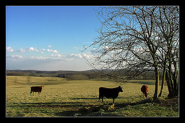
This looks a little over sharpened to me. I think this would look better if you made it the full 640 pixels wide and did not use up so much of the area with the border. |
|
| Photographer found comment helpful. |
|
|
01/29/2005 08:39:21 PM |
|
slightly oversharpened imo |
|
| Photographer found comment helpful. |
|
|
01/29/2005 07:26:47 PM |
|
I love this. The border works for me. Sky isn't washed out. 9 |
|
| Photographer found comment helpful. |
|
|
01/29/2005 03:18:27 PM |
|
nice composition but the border seems too heavy, and for me at least, spoils the pastoral effect |
|
| Photographer found comment helpful. |
|
|
01/28/2005 06:53:06 PM |
|
Beautiful, peaceful setting, nice landscape |
|
| Photographer found comment helpful. |
|
|
01/28/2005 03:18:05 PM |
|
Front cow is to dark for my taste |
|
| Photographer found comment helpful. |
|
|
01/28/2005 01:22:13 PM |
|
Post card-like setting and well composed. Size of the border is a bit much in my opinion but took nothing away because of it. ((7)) |
|
| Photographer found comment helpful. |
|
|
01/28/2005 12:52:44 AM |
|
| Photographer found comment helpful. |
Theme:
Classic /
Light /
Dark
Home -
Challenges -
Community -
League -
Photos -
Cameras -
Lenses -
Learn -
Help -
Terms of Use -
Privacy -
Top ^
DPChallenge, and website content and design, Copyright © 2001-2026 Challenging Technologies, LLC.
All digital photo copyrights belong to the photographers and may not be used without permission.
Current Server Time: 10/11/2026 02:51:55 PM EDT.






 Add photograph to your favorites
 Add photographer to your favorites


