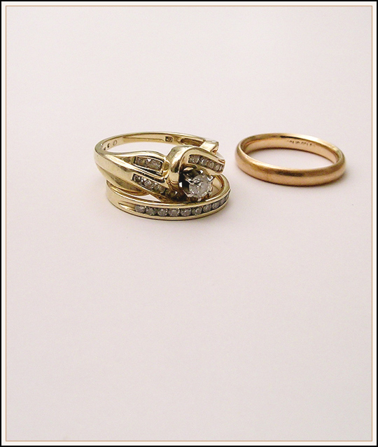
Nice shot of very different rings! The composition is a little odd to me - i would have placed them further down in the frame, because they seem like they're floating in air. Pleasing picture, otherwise.
I like the simplicity of the picture. The position of the rings in the frame seems a little off to me--I want to nudge them around a little or perhaps crop it differently. But that's a matter of personal taste, I suppose.
I like this composition, it's simple and works. I like the border too, but the frame is rather large. I would of cropped a little more from the bottom, as the rings aren't central so would work well. well done........8
You gave applied th rule of thirds and placed these rings on the top third.
However for me there is too much space in this image.
I would have preferd a tighter crop, with the centre of each ring being on the thirds line left to right
and the bottom ring being on the bottom thirds line bottom to top.
I love the creativity. The composition is excellent, would look great in a frame. I would frame it and sign it to my mom. I'm tring to figure out if the colors and the carats of gold, so in color aspect my attention is being captured. I can almost read the text showing a nice shooting angle and focus. The shadows are close and tight good choice of lighting. I would love to see this ribbon. Good Luck. (10)






 Add photograph to your favorites
 Add photographer to your favorites


 Photographer found comment helpful.


