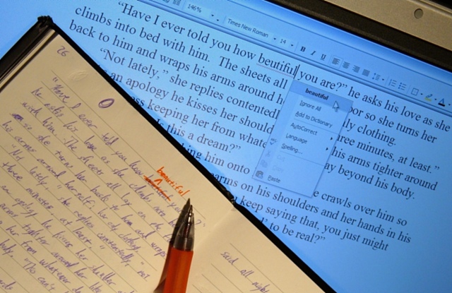
I laid my laptop flat on my desk, taped open a page from my writing journal, then set my tripod on my desk to take a picture with no flash. I had to lower the brightness of the screen as I only had a Snake Light to light the pages (hence the colors being a little off (I'm still learning how to use GIMP and every attempt to fix the colors ended in disaster)). The only adjustments applied were a Gaussian blur to clean up the black lines between the pixels on the screen and Unsharp Mask to bring the text and everything else back into focus.
Actually, I like the warmth of the colors on the written page vs. the cold colors on the computer screen (warm, emotional handwriting vs. cold, unfeeling technology). Of course, I'm merely justifying inexperience.
I'll just say I meant to do that.
Statistics
Place: 37 out of 245 Avg (all users): 5.7651 Avg (commenters): 6.8889 Avg (participants): 5.5377 Avg (non-participants): 5.8906 Views since voting: 1244 Views during voting: 367 Votes: 298 Comments: 19 Favorites: 0
I would like to see the screen with less blue. It is a very good concept but i feel the composition isnt as strong as it could be. I think it would help to have the handwritten text sharper in focus.
This is a great idea that fits the challenge wonderfully. Times sure have changed! The pen could use a little more sharpness, but the Word screen couldn't be better.
I like the idea here (especially the circles on the page trying to get the ink to flow). Having the book right up against the monitor like that, though, seems a little off to me (maybe it's the shadow on the monitor?) Perhaps there is a slightly different angle at which the book could be held. Part of me also thinks the top part of the monitor shouldn't be included, but then you get to see the book binding, so why not the "monitor binding"?







 Add photograph to your favorites
 Add photographer to your favorites


 Photographer found comment helpful.


