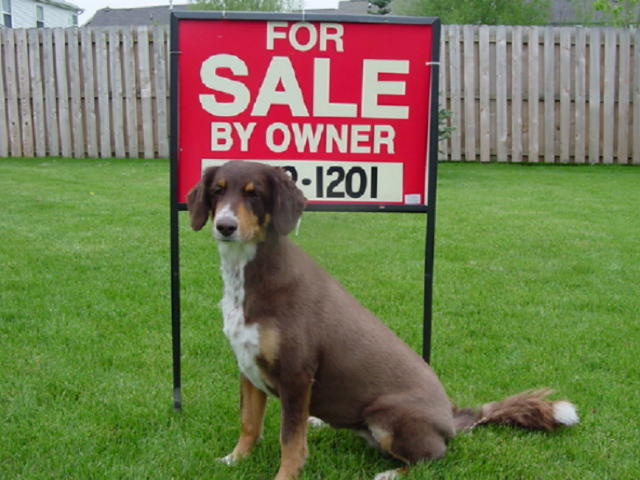
Ha Ha. Poor dog, it's cute, though. maybe cropping both the left and right more tightly, or putting the dog a little more to the right (off-center), or taking the picture from an angle would have given this picture a little more interest. I know that may not have been possible, though.
It seems a tad unfocused -- I think maybe a vertical shot, taken at more of a top down angle would have helped you lose all that "empty space" on the sides of the image and removed the roofs of the houses in the background
And I've always been thinking these signs were for the houses . . . ;o) Interesting take on the challenge, cute dog. Picture feels a little fuzzy and the dog's paws are cut off, though.
this photo is only 62k. maybe if you would have saved it at a higher quality jpeg, you wouldnt have the problem with the for sale sign. also, this photo just doesnt look like an advertisement. it's cute, but it would have been more appropriate to have the house in view and get rid of the dog.





 Add photograph to your favorites
 Add photographer to your favorites


