Challenge:Old and New (Basic Editing III) Camera:Samsung Digimax 530 Location: Staten Island , New York Date: Jan 24, 2005 Aperture: Auto ISO: Auto Shutter: Auto Date Uploaded: Jan 24, 2005
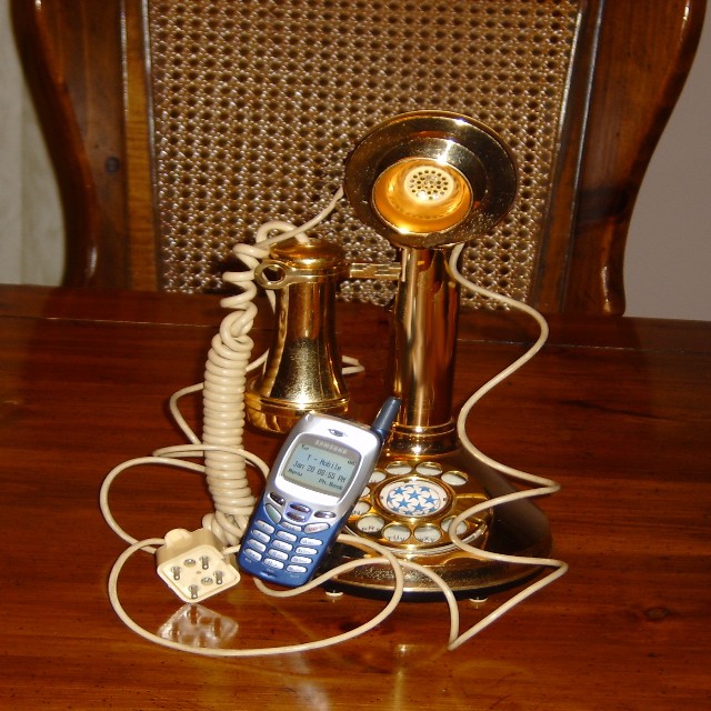
I think your composition would have been better without the plug and cord being so prominant, and the chair in the background is kind of busy. Either remove it or shoot with a shallower DOF to separate the subjects from it. 5
I have the same phone type and the same provider. :-))) Great idea, though, the tilting of the table is a bit distracting, and the colour of the wall doesn't help the mood. I hided it on both sides with my hands and I got a more moody result that way. I would improve lighting as well, more diffusion for the metals, because lighting is a bit harsh on them.
This photo seems like it was streched from its original porportions and I think the composition would have been better if the table was a straight horizontal line instead of being crooked.
Sorry, but yet another old phone vs. cell phone shot. This will suffer because of the number of similar entries.
Will also suffer because it looks like the resize has squashed the image. Make sure you 'Constrain Proportions' when resizing.
Other than that, it is not an inspiring image, The cord just looks messy and contardicts the supposed 'oldness' of the old style phone. Could have been better with a nice background and removing the cord.
Nice idea, but snapshot quality (compositionally). Not trying to rip you....but if you had take it from a more interesting angle, or used some side lighting for a moody picture, it would have been a lot better. Keep this in mind for next time!







 Add photograph to your favorites
 Add photographer to your favorites


 Photographer found comment helpful.


