Author Thread
Post actions
nice work! that was one of my favorite finds when i was visiting out there about 15 years ago.
Comments Made During the Challenge
Post actions
Post actions
i felt you should show more of the church
Post actions
Post actions
Post actions
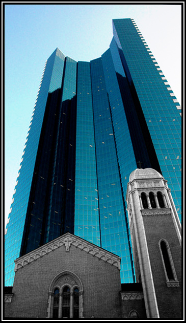
I would levae more space on the right, the side of the church could start from the right bottom corner. I wouldn't have deaturated the church, what colour it was? Grey? Brown? Red? Yellow? I think it would have worked well with the blues, but maybe I am mistaken. Composition is great! :-) The view, too. :-)
Post actions
At first I thought the lights in the offices were a bit distracting but then I see it gives the photo more of a reality, love the angle and the way the church blends in...
Post actions
Wow, quite a powerful image with those strong verticals towering over the older structures. Good job 8
Post actions
this looks strangely familiar...this looks like a bccutter original, but then, i've been known to be wrong before.
Post actions
This is amazing, I love the view in which this was shot, it really shows the contrast between the two, congrats on a great capture! 9
Post actions
Almost feels like a photoshop superimposed building. I'm sure it isn't
Post actions
Post actions
Post actions
Well done with half desaturation... like the blue of skyscraper... I would choose something more simple for border.
Post actions
How'd you do that? I want to know but other wise it is very creative and unique!
Post actions
This is basic editing??? Looks like the church is desaturated.
Post actions
very good the contrasts between the colors of the church and the skyscraper. fine composition





 Add photograph to your favorites
 Add photographer to your favorites

 Photographer found comment helpful.


