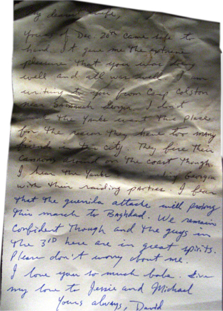
I wanted to do something really different here. The top of the letter is a Civil War letter and the bottom is an account from Iraq during the march to Baghdad.
I used tea stains on the top portion, along with a little flame help, dirt, and dust. The crinkles of the paper on the top allowed for some key shadowing used with a light source coming from the bottom of the letter. I used black ink for the top and blue for the bottom.
Two very different conflicts. One old, one new. A common longing for home....
Statistics
Place: 123 out of 245 Avg (all users): 5.0969 Avg (commenters): 7.5000 Avg (participants): 4.9898 Avg (non-participants): 5.1518 Views since voting: 935 Views during voting: 388 Votes: 289 Comments: 14 Favorites: 0
Oh, sorry I wrote a comment and never finished it for some reason... Ahem! A lot of people arn't going to take the time to read this and the detail you put into it. I did and I think it's a pretty good idea but on a technical side it's a little grainy and the straight-on angle with the plain backround isn't very interesting. Perhaps if you put it in someones hands or a something else then tjhe whole idea could have been more involved.
Excellent! The idea and execution are just great! My conflict is how to view this - it it really a photo or more of a "scan" using a camera. In the end, I don't care because this is so original. 10
Interesting concept (it took me a second to realize the split you have in the letter). The lighting feels a little off to me, though I see the thought you put into making the older part of the letter darker while brightening the newer part. The bright white on the left and top is a bit too harsh.
I think this was a really creative idea!! I like the way this picture was taken.. I really like how you can tell where the old and the new fits into this image. Nice shot!
What an innovative idea! I think the main detractor with this shot will be lighting and noise, but the idea itself and the emotive nature are it's saving graces. Neat! :o)
I really like this idea and its execution. The language in the Civil War letter seems a bit modern for when it was supposed to be written. Also, I think yellowing the upper portion of the letter would do better in suggesting its age while making it easier to read. Small quibbles, though. 9







 Add photograph to your favorites
 Add photographer to your favorites


 Photographer found comment helpful.


