Challenge:Bridges (Classic Editing) Camera:Canon PowerShot A40 Location: my house Date: Mar 9, 2003 Aperture: 6.33984 ISO: 100 Shutter: 1/200 Galleries:Macro Date Uploaded: Mar 9, 2003
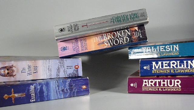
Clever idea. I like the overal composition here, with the crooked books providing interesting angles to look at. Now note the light highlight on "Taliesin," which obscures the image. And I feel your tones are all so simillar that it makes it uninteresting. Try a lighter or darker background, and different colors of books?
Ummm, pushing the challenge theme a bit, but accepted (barely). The glare on the "Taliesin" book is very harsh (try softening the light source with gauze or the like). Color and focus seem very nice. Why such a crooked bridge (not an engineer, eh)? 5 Swash
Interesting concept, good title, poor execution. The condition of the books detracts from the image, as does the overall centeredness of the shot. Plus there's a great deal of glar on a few of the books, and the image lacks a range of tones.
Too much glare on the book spines, use a more diffuse light, or try a circular polariser. Also, it looks a bit flat, try coming round for a dramatic angle, like what loads of folks have done with real bridges this week.
See, I like this. Way out of the box thinking. But I can't tell if the bridge books are actually supporting themselves so it looses a little. But good creativity.






 Add photograph to your favorites
 Add photographer to your favorites


 Photographer found comment helpful.


