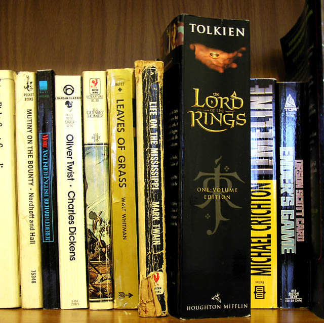
Too rigid. How about a big pile of books? That would bring in more dynamic. You have too many vertical lines. Also, chose another light source next time to avoid the gkares on the books' backs. 4.
I like the idea of the two contrasts you are doing here--old stories (e.g. Lord of the Rings) with newer ones (Timeline) and well-worn books vs. newer books. I think the lighting in the picture could be a bit better (the glare off of the books on the right in particular is distracting).
Books were smaller back then! That book is huge! I love this idea but think the composition could be a lot better somehow, there is a natural light coming in on the top right for example, don't know, maybe you used a flash also...
Judging by the reflections off the slick, new bindings I'm guessing that there was light coming in from behind the camera (or from the flash). This light needs to be removed so that it doesn't obscure any of the titles. Other than that, I like this picture and its message.






 Add photograph to your favorites
 Add photographer to your favorites


 Photographer found comment helpful.


