COMPOSITION
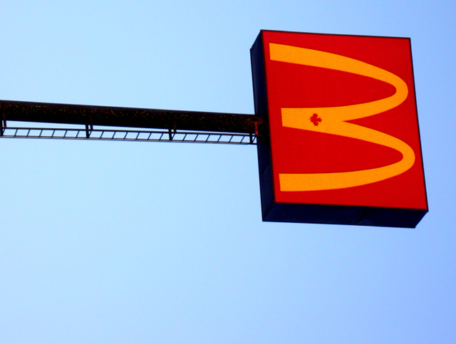
Overall, I think the composition of this shot feels a little static. Though the eye is drawn towards the "3" by the pole, and it is in a natural position to draw from left to right, the even horizontal leaves the eyes no where else to go. I assume you probably used the straight horizontal to even up the three, but did you try it with a tilt or angle to the sign? Also, being on the top third also makes it top heavey to me. Maybe lower in the frame would help?
TECHNIQUE
The focus is fine, though it seems to have a bit of noisy in it. Judging by the colors, it seems that this was taken either at dawn or dusk; it just has that "almost dark" look to it. Did you use a polarizer? That may have made your blues even deeper, allowing more contrast with the sign.
OVERALL EFFECT
According to half of the voter's interpretation, you met the challenge. :-) Aside from that, the picture, though technically sound, comes up a little flat to me. You have some wonderful colors, and I think really using those in contrast to each other would have added some interest.
Some people won't like this because it's a man-made object, but I think it's one of the best in the challenge. Good graphic appeal, creativity and interesting colors and composition. Well done.




 Add photograph to your favorites
 Add photographer to your favorites


 Photographer found comment helpful.


