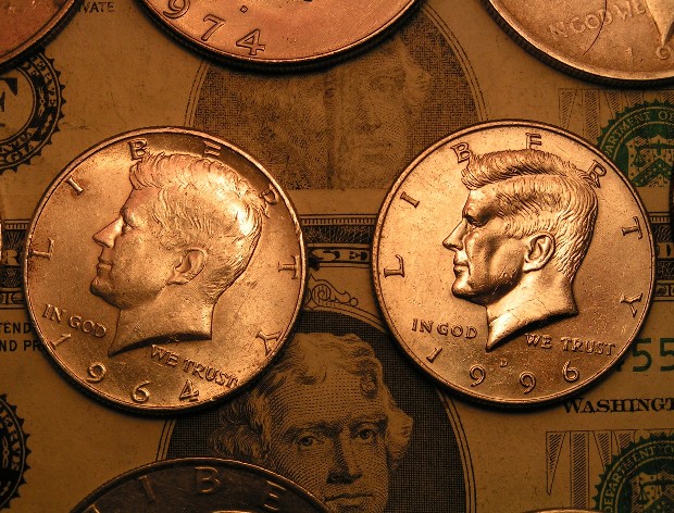
This is a great idea dn it is better with the money as a background in the back. It is also nice because you made it look like it is somewhere in 1964 or colonial times! Very nice, 10!
Very nice shades and sharpness! What I don't really like, it's composition. I feel like it wanted to be somewhat a bit chaotical (cropped coins), but there are too much rules in thiscomposition: coins visible on the top in a ruled row... It's diffiult to make chaos that looks good, but I think it would help the mood. Don't misunderstand me, I think this is a nice photo, I just wonder how to make it more better. :-)
I like the idea alot. A couple of things that might help it - the two main coins could be lined up better so that even if you wanted them at an angle, they'd be at the same angle as each other. They are just slightly "off". I like the background of the paper money, but I'm not fond of the extraneous coins at the bottom and the top. Again, in this situation, I think symmetry would improve the picture. Crop the same amount on both ends.






 Add photograph to your favorites
 Add photographer to your favorites


 Photographer found comment helpful.


