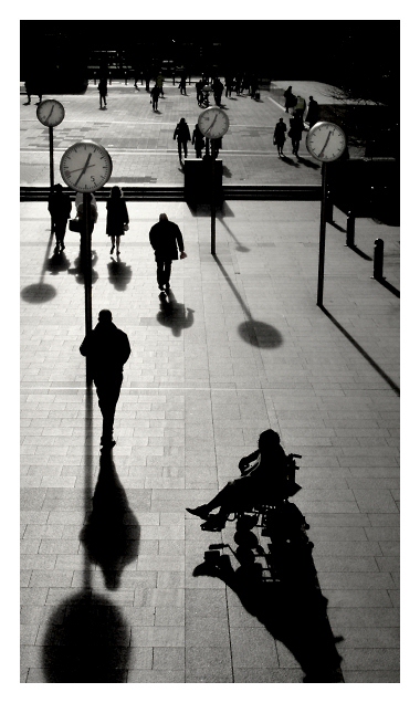
I was shooting this because i thought it would be fun to have visible faces - on the clocks - along with the challenge intent of having faceless people; then the young woman in the wheelchair passed across the frame, and it struck me immediately that the lives of so many disabled people are faceless in an entirely different way.
I'll be interested to see how many people pick up on the faces of the clocks, though. Not expecting many.
It's struck me that I rarely put any processing information, or shooting information, on any of my shots these days. Here, I was shooting into the light with a properly compact camera - this was shot using the viewfinder, rather than the screen, I think. Given that depth of field is so great on these cameras (the EXIF reports that the focal length of this shot is 10mm), it's more important to use the focus-setting half push of the release to set the exposure of the shot. Here it was at the point of those stairs where the sun hits them - the brightest part of frame. That way, one can be pretty certain that nothing is going to be over-exposed. Almost everything else can be sorted in post. I also keep the camera permanently set to a -0.6 exposure compensation - for exactly the same reason.
I've also used a wider than usual border to add separation between the image and the dpc background: quite a lot of the tones of this image circle around that same colour, and I didn't want it to feel like an extension of that plane.
But it's not about the shooting or the camera, it's about the image.
Statistics
Place: 4 out of 173 Avg (all users): 6.7087 Avg (commenters): 8.5714 Avg (participants): 6.7895 Avg (non-participants): 6.6519 Views since voting: 3495 Views during voting: 398 Votes: 230 Comments: 35 Favorites: 29 (view)
Amazing work...this one is stressing me out even though there is a bit a of lazy feel to it... I guess to me it displays time passing without us realising...
I caught the contrast between the clock faces and the faceless people, but to be honest, I don't think I noticed the "extra" relevance of the person in the wheelchair -- there are so many people in chairs around where I live that they are usually treated more "normally" than in many places.
I still use my 4 year-old Olympus a lot too ... nice work!
I like this very much and think that it works well with the busier top end..it would have been nice to have them space themselves out neatly for you..but life is seldom that kind to us.However, I feel the concept of the numbers increasing as you scan up the image really adds to it`s impact.
I didn`t get round to voting in this challenge but this would have scored very highly if I had.
Thanks to all for votes and comments. My second 4th of the year (once described as the worst of all possible finishes). a few poeple picked up on the confusion at the top of frame, which I did want to try and do something about - but cropping to the edges of the clock faces relegated them in the composition too far, and cloning out the other people there ... well, after a while it just seemed wrong - part of the point was the press and rush and chaos of the people. The crop overall is so narrow because that's how this scene is - immediately to the left of this we get into cafe-world, and that over-confused things, and immediately to the right there's a line of trees, likewise.
Oh - and for those who crave expensive cameras, the one used for this shot cost £110.
Oh again; this was challenge number 301, it appears.
Ed ... I must admit I missed the significance of the clocks as faces. Very clever and subtle allusion; I had been thinking more along the lines of "faceless slaves to time" as your motivation here. Alas, you'll have to settle for the "thinking man's blue ribbon".
Other entries with "crowd" or street scene subjects are faceless only in the sense that the faces are too far away to see, or just happen to be turned away or obscured. This one is different. It has a point to it that is cleverly sympathetic to the spirit of this challenge. It's a visually striking image as well. 8
wow--love this! love the light and shadows...it's really cool how there are so many clocks and people hurrying along...then that one person sitting there, seemingly mot moving...like a contradiction. great stuff. :)
Holy cow! This shot a beauty. A gerat angle with the perfect use of backlighting. The time theme is great too, I'm really digging it. To be really picky, I would either crop a little bit off the top, or clone out the little white specks in the shadows (one at the top of the image and one on the upper middle right) just for the fact that those areas do not necessarily add to the image, and anything taken away from this great shot would be a crime! This is beautiful work --- straight into favs.
This picture difinitely has something interesting to offer the viewer. An interesting subject, excellent shadows, good composition and satisfies the challenge. Only one suggestion would be to crop out the top half of the picture just above the last clock and since this is an advanced editing challenge, you could have cloned out the feet at the top after cloning. Great job though.
I think I have seen another shot taken from the exact same position. I think this would be a very strong entry for the 'Light' challenge too. Nice one. Love it.





 Add photograph to your favorites
 Add photographer to your favorites

 Photographer found comment helpful.


