filters: greyscale conversion and enhance colors
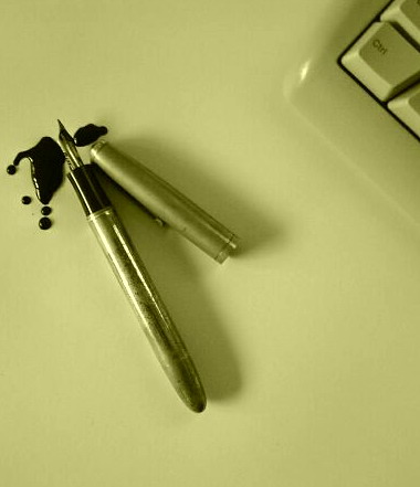
what you can see there are my computers keyboard
and a 60 years old fountain pen(on wich there is some sort of corosion).As you can see the shadows from the pen are going straight in the direction of the keyboard symbolizing the unevitable evolution.
Statistics
Place: 149 out of 245 Avg (all users): 4.8974 Avg (commenters): 5.5000 Avg (participants): 4.9167 Avg (non-participants): 4.8870 Views since voting: 1284 Views during voting: 383 Votes: 273 Comments: 9 Favorites: 1 (view)
I don't really like the colour tones here, somewhat it reminds me to a failed WB setup, or, if it was the purpose, it dowsn't really give me the Matrix feeling. I would change your composition as well, for example a diagonal one with the keyboard, which divides your photo to two equal parts, one for old and one for new. I would choose a lower angle as well, approaching from the side of the pen. The idea is nice but could be implemented with a higher quality.
At first I thought you should show more of the keyboard, but then I realized that you knew what you were doing. :) (The keyboard would have dominated the pen if more of it was shown). I suppose there could be a hidden (or intentional?) meaning in choosing to show only the "ctrl" key--contrasting the modern "control" or rigidity vs. the "messiness" of prior times. Or maybe I'm reading too much into it...
great idea, too much white space for my taste. The green cast I don't like - but maybe you were going for that. nice creative though, I really like the idea
So you're saying that fountain pen users have a lack of 'ctrl' over the ink? I think using a keyboard of a different color than the background would make it more distinguishable. Otherwise, good picture.






 Add photograph to your favorites
 Add photographer to your favorites


 Photographer found comment helpful.

