COMPOSITION
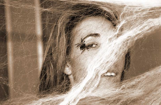
The webbing, helps to draw the eyes from left to right to the spider and the face. I think, however, it would have been more effective to crop the right side, so that the face was on teh edge, and the spider was on the right vertical third line.
TECHNIQUE
Great focus, and the sepia tones really add to this picture, I think. Straight black and white with a lot of contrast might have been interesting as well.
OVERALL EFFECT
Overall, it is a good picture. I know when I was voting, I wondered if the spider's web was supposed to be the bridge. I am suspecting, from comments below, that most people wondered teh same thing. With that thought in mind, it is a good photograph that makes people stop and think. For some reason, I kept thinking of Halloween or a haunted house when looking at it -- it just has that mood.
I guess I don't see the bridge here. Unless there is something about webs that I don't know. Maybe the web is refered to as a bridge? Either way, I don't see the purpose of the person in this photo. is the focus suposed to be here, or the spider, or the web. Her teeth are so white, and in such a place that I find myself staring at the teeth. lighting is a little harsh on the web in a couple spots it's a bit too white. the sepia tones are good, but not sure if this helps the photo or not. Good luck in the challenge.
Since I'm the biggest arachnophobic around, this picture totally makes me shutter! Not sure where the bridge is, but you definitely get points for originality.
Fun/interesting shot. Is the bridge the web? (I don't see what I'd call an obvious bridge...) That's a plastic spider, right? Focus on the woman is very sharp. The faked webbing - on the left it works pretty good, but on the right...honestly, it looks more like hair or part of a horse's mane. 5 Swash
This is definitely a good photo composition and I like the toning as well, but I am at a complete loss as to how this fits in the 'bridge' theme... - setzler






 Add photograph to your favorites
 Add photographer to your favorites


