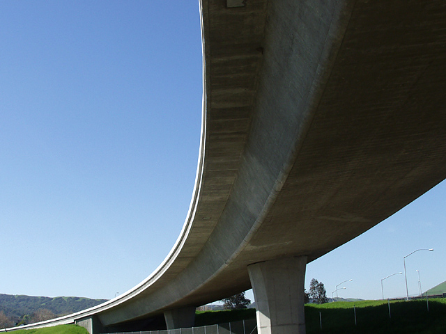
Taken of the interchange of interstate 580 and 680 at Dublin CA. This is a very busy interchange with several bridges carrying thousands of travelers each day. I wanted a mid day shot with no vehicles, and it took quite a while for the momentary opportunity to arrive.
Statistics
Place: 91 out of 229 Avg (all users): 5.7178 Avg (commenters): 6.0909 Avg (participants): 5.5379 Avg (non-participants): 6.0571 Views since voting: 1288 Votes: 202 Comments: 14 Favorites: 0
Tim,
Thanks for a very helpful critique on my " No Turning On Bridge". Each of your ideas sound good to me and I certainly appreciate your input. This was a situation where I was rushed to get a shot and of the several I had, I had to choose one to go with. My vantage point didn't allow much movement and it seemed as though something else would always jump into the photo. Keep up the great work on the CC, I and the rest of the DPC'rs thank you all.
Dick Pattee
The first thing that caught my attention was the strong visual impact of this photo due to its dynamic composition. Compositionally it is very effective in communicating the sense of beauty, size, and strength of this structure. I would have preferred to not see the trees just to the right of the closest column. Instead, by moving to the right you could have blocked those trees with the column and displayed a solid blue shape that would better reflect the blue area on the left side of the bridge. I understand why the image is tilted slightly so that the apparent horizon line is level but by doing that the columns are tilted and the bridges looses some of its structural balance. it's a bit of a trade off and I am simply wondering what it would look and feel like with the columns more vertical.
Your intent was to shoot this scene at mid day and while that works just fine I am wondering what this would look like taken at dusk or nighttime with a much darker background. A timed exposure could give a real interesting deep blue color that could compliment the color of the concrete very well. It could simplify much of the background and empahasize the composition even more. Of course I would have to see that to know for sure. Just an idea.
The colors and values are very natural looking and the contrast is appropriately bold. It is very sharp but I think I would have preferred a much shallower depth of field where the focus was on the foreground 1/3 of the bridge and to go slightly soft as it receded. I feel that this would support the already strong sense of depth and 3dimensionality (is that a word?).
I love how you took a pretty common structure and created a very artistic image out of it. Good job.
Nice image, but it doesn't do much. It looks plain and needs more depth and texture to make it look more interesting. Perhaps taken from another angle would have looked better.





 Add photograph to your favorites
 Add photographer to your favorites


 Photographer found comment helpful.


