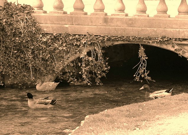
That bright white spot at the bottom of the photo is just a patch of sunlight--it was a beautiful day when I took the picture! I wanted to crop it out, but I had already cropped the photo quite a bit and if I had completely removed the spot I would also have removed one of the ducks! This was kind of a "spur of the moment" shot so I hope to do much better in the future. Thanks to everyone who made comments!
Ducks Under Bridge
Hi Rachel,
Critique by Silver Fox.
Your composition is quite good here with good depth of field and a good idea for the Challenge.
The Visual impact is pleasant to the eyes of the beholder when looking at your picture. The rushing water heading towards the bridge gives
the ducks motion as they keep themselves heading upstream..
Focus is quite good, and the lighting seems fine for a daylight shot.
Your choice of Color seems okay, sepia tone appears just right, wonder what this would have looked like in colour.
The addition of the ivy hanging from the bridge gives the photograph something more to look at, however, because the theme of Challenge was “Bridges” you may have been better to back up about 10 feet and given us a better view of the bridge instead of concentrating so much on the three ducks. They would still have been in the photograph, but not have been the “main” subject.
The bridge looks like it has some beauty to the “rails” and it would have been nice to see more of them.
Now when you cropped your photograph, what happened to the bottom right hand side, what is that white washed out piece? Could you not have taken that out? Or is that why you had to come so close with your camera and lens to start with?
Overall, you've taken a nice photograph to be proud of and you've done a nice job of it too.With a little practice, you'll be pulling out 10's in no time.
I noticed that you’ve just joined the DP Challenge, so don’t take this critique personally.
It’s only your first entry. Take some time and look at the other photos in the Galleries, and then shoot some more and some more and I would enjoy seeing some more of your work next week and the week after that too.
And remember to have some fun while you learn. . .
Sincerely,
Ed
I like the tones in this image. I also like how the ducks are slightly blurred in relation to the motionless bridge. That ivymakes all the difference. I think that this is well composed and that a lot of thought went into it. Your objectives seem clear and the choices leading to that seem appropriate, so I'm giving it a 9. Nice work.
This seems flat to me - I think the color adjustments (sepia, I imagine) were not done quite right, and the colors are off. Sepia I think has more contrast, with the orange/brown colors taking the place of grays.
What is so bright on the bottom right corner of this page as to wash out a little? Would've like to have seen this from a little further back to capture a little more of the bridge and not concentrate so hard on the ducks. NIce color tones.






 Add photograph to your favorites
 Add photographer to your favorites


 Photographer found comment helpful.


