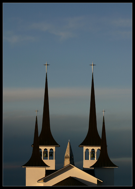
Amazing shot! If people only knew how difficult this angle must have been and to get the steeple of the other church (which is far away) in between...this will make a great postcard.
A beautiful symmetric entry that should score very high. The church is slightly off center. I'd like it dead center or obviously off to one side or the other. Good luck!
Beautiful lighting, and very interesting composition. The architectural style of this building reminds me of the photo of the building that ribboned in the black and white challenge. I think I would have cropped a bit more off the left so that it matched the right side, since this is clearly (?) intended to be a centered composition.
thats so cute, could see it on a greeting card, whole series, think it needed
to rotate a bit to the left? could be an optical allusion?
takes me back in time somehow? 8
Very creative, but is it slightly tilted? A composition like this has to be as straight and symmetrical as possible, and this looks ever so slightly tilted to the right.. or maybe it's just me. Anyway, good stuff.
upon reflection I am bumping this shot to the top 3 in my pantheon. I love the framing, allowing the sky enough room to push back against the spires; audacious and lovely. The perfect bi-lateral symetry and cool, almost clinical color tones will cause some to criticise your composition but this works very well IMHO.
Excellent picture. Wonderful lighting, interesting composure. I wish that I could be there again, I haven't been in Reykjavik in many years. The possibility for beautiful pictures like this abound, it's nice that you have the eye to take advantage of them.
This is a great shot! I keep being drawn to the slightest imbalance in the symmetry though? Not sure what it is - perhaps a tiny anticlockwise rotation is needed, not sure...





 Add photograph to your favorites
 Add photographer to your favorites

 Photographer found comment helpful.


