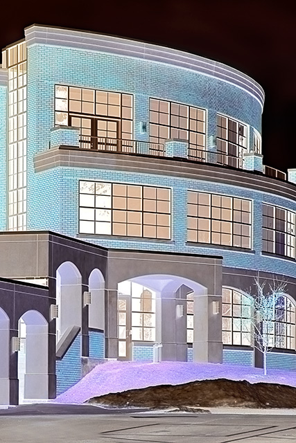
The whole week had been cranky and overcast. No color to the sky and as such it always looked like blown out highlights. I decided to put a creative spin on the whole, making it look more like a CAD drawing than anything.
I'll probably get a brown for this one, but I'm erring on the side of the artist and what he likes, not what the crowd expects.
A bit of levels, a tad of highpass, a clone out of the garbage can that keeps following me around and sneaking into every shot I take. And then an Inversion. Happy Coloring!
Statistics
Place: 188 out of 225 Avg (all users): 4.8674 Avg (commenters): 5.8571 Avg (participants): 4.7596 Avg (non-participants): 5.0130 Views since voting: 1058 Views during voting: 244 Votes: 181 Comments: 7 Favorites: 0
Mine won't be a popular comment, but to me, everything this building had to say has been taken away by the processing of what would otherwise have been an appealing image. I suppose the negative effect is suggestive of a blueprint, but I just can't relate to the building that way. Its lines are certainly faithfully rendered but its character is gone. My problem. I guess. Sorry I don't like it, but I hope you'll get plenty of support from elsewhere. 4.





 Add photograph to your favorites
 Add photographer to your favorites


 Photographer found comment helpful.


