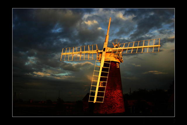
Gorgeous shot, almost perfection apart from a couple of little niggling things I can see. The border is rather large and does take away from the shot a little. I am a lover of dark photographs, so I am especially enjoying this one, but I do think that you should have just a tad bit lightened the horizon. If i tilt the laptop, i can see trees in the background, granted there are also some light posts and houses, but maybe just a little lightening.
Certainly eye-catching, although I never got to it in the voting. I agree in general about the border - would have been worth a .something on the score I think - though inmy opinion some work to bring out the rest of the landscape would have made it feel less PS'd. Not saying it is PS'd, but it feels like it's been deliberately darkened to isolate the 'mill. More definition (not masses, but enough to see that horizon properly), and even some lightening of the sky toward the horizon would have added to that massive sky feel that is so imperative in communicating the feel of the Broads). Check out some of Tom Mackie's stuff - feature thhis month in Practical Photography of just this territory.
Thanks for all the comments folks, most I've received and by far my best score. I just wonder how it would have placed if I didn't mess up on the border??
bpickard, thanks for the translation, bablefish did a bad translation for me - yes, it should have been "evening light"
too much border, pretty dark, perhaps using curves to make it lighter and bring out more detail would have improved this shot, especially in the bottom, non sky part of the background
Great composition and subject matter. Lighting and detail are good, rich in color without being over-saturated. A little big on the framing, but took nothing away because of it. ((8))
Afternoon light, indeed. Striking image, made less striking by the murky treatment of the sky/landscape separation and an overalls ense of blocky softness. The massive black frame is not helping at all IMO, either.
this is beautiful, but a tad dark. don't know what i'd do any different, so i'm just going to sit back and enjoy it for what it is. thanks for sharing, and good luck!
The border on this picture is just way to wide. I find it take to much away from the photo. The photo does have an interesting contrast on the blades of the windmill and it accents the red brick very well. The sky is a little dark but I find it brings out the colors and adds character to the overall picture but again the border is just to big. Kepp up the good work and best of luck in 2005. <7>
Wonderful how the light strikes the mill with that dark background. The best quality of light as well. The only downside of that darkness is that it is hard to judge the size of the windmill. Is it really large, like the standard Dutch windmills, or is it really small or garden sized? The only things that tell are perhaps the windows. Perhaps it sounds negative, but that is not how I mean it.
This image is fantastic, I am a fan of borders but in this case I find the imbalance between the thickness of the sides, and the top/bottom to be rather distracting.
I fear you will be hit hard because of this.
Love the golden cast on the windmill. Your walking a thin line when it comes to the processing here, but I think the pushed appearance of this image works in the end. 8.






 Add photograph to your favorites
 Add photographer to your favorites

 Photographer found comment helpful.


