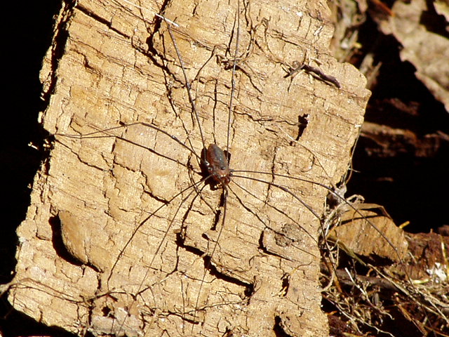
I hate spider but pictures are ok. I find the body of the spider to lack clarity and the rocks have a little to much contrast. Very interesting subject tho. Good luck and keep up the good work in 2005.
The big thing here is light. It's direct sunlight which is washing any and all color out of the image. That creates that "flat" look to the shot. Composition is actually pretty good though. I think with less sunlight on the spider you could have ended up with some pretty cool shadows from the legs.
oouu, you search took a risk with this one, considering all the arachniphobes on the site! hope this isn't getting overlooked in this huge challenge, and that you're getting good feedback. good luck with this and all the challenges yet to come!
I think the bright sunlight creates a difficult lighting situation here, evidenced by the deep shadows. The spider is captured successfully, well enough. Just not enough of an interesting composition for me.
The spider here blends in a little too closely with the background. (Which is unfortunately a little too busy). Good idea though - nice to see you've chosen a spider as your subject rather than some colourful, more cliched insectoid subject.





 Add photograph to your favorites
 Add photographer to your favorites


