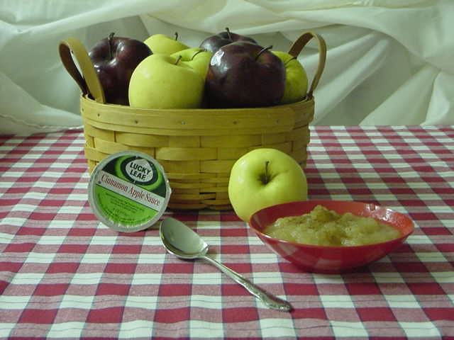
Very nice. The green tint needs to be fixed -- either color balance with the camera, or some kind of levels work in your image editing software. The focus seems a tiny bit soft on the bowl and the sppon handle. My last suggestion would be a slightly tighter crop to remove some of that "extra" tablecloth space.
I like the mix of apples in the basket, and the inclusion of the the bowl and spoon makes you want to reach out for it. I think it would work better if you either zoomed in closer or left all the blank space to one side. I could see add text at the upper right and lower left, but the upper left seems like wasted space to me.
I think this could have been a better photo with a lower angle. The high, far-back shot you've chosen makes everything seem very small ... and I think that's a drawback for a food shot. A closer angle might also have made the product more dominant.
I look at your shot to see how it strikes me as a consumer. It is simple and effective except for the product. It is to small & I would not remember the name when I got to the grocery store. Your picture however is a lot better than some of the artsy ones that totally miss the point. Keep it simple and with something the consumer will relate to which is what I think you were doing.
Three things - first the nitpicking one. Turn the apple sauce container a bit to the left. 2. There seems to be a "fog" over the photo. I copied it into software and ran auto levels. It brightened up and seemed more alive. 3. Imo the composition is a big sterile. Maybe a close up? Something that adds drama and interest like stacking the apples behind the bowl of sauce and the product.






 Add photograph to your favorites
 Add photographer to your favorites


