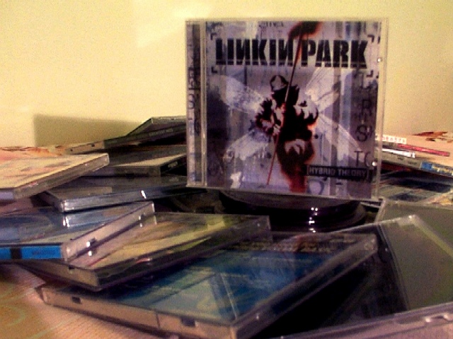
Such a great CD, such not a great advertisement for it though. I think the CD case by itself (without the others) on a nice background, laid down, with maybe the cd not set in the case, but outside of it...eh...
I don't follow this ad very well. Are you selling Linkin Park cd's or just cd's in general? In either case I would have made other titles readable also. More lighting and less shadow would help too.
are they all the same cd? I like the layout but for advertising a band not too hot. your shadow on the wall is distracting and i am trying to figure out what the other cds are takes away from the main product. it does not appear to have good focus either.
I don't find this arrangement visually appealing. Maybe having the CD sitting atop a pile of caseless CD's would be more visually appealing. Or maybe shoot from a higher angle with a little more light on the subject.
Without actually knowing what any of these covers look like in real life, it still seems to me like the colors aren't right in this picture. Did you try using either your camera's color balance, or tweaking the color balance in your image editing software?
A CD advert that looks like a CD advert should look. I think the "suggestion" that of all the CDs around, I should check this one out. This photo isn't weighted down with overly anal technical perfection. It is what it is. And - it meets the challenge by making me at least want to check out that CD. Excellent composition - imo.







 Add photograph to your favorites
 Add photographer to your favorites


