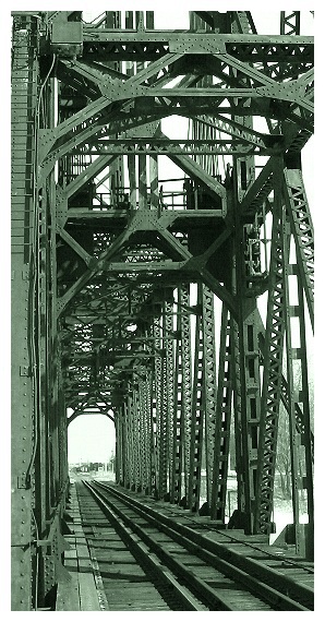
I wish this photo were a little wider. I can't see why the edges would be cut off unless there were something there that were unsightly. This is extremely well taken and I'm giving it an 8 anyway. I just wish it were a wider photo showing the sides of the bridge. Well done
Well taken - so many people have gone for a symmetrical composition with this kind of shot, and this is so much more interesting. Also one of thhe few b&w shots that really looks like it benfits from the monochrome. Like the contrast of the horizontal and vertical iron-work too. A really top photo, great work.
Wow. Really nice photograph. I like the way you've stood off to one side instead of taking your shot from "dead centre". Using your imagination helps a lot, doesn't it! ! My only thought though is why you cropped so close? why not widen it out some more and show more of the bridge? It's made to be shown! The workmanship is outstanding on a bridge like this. . .
Nice shot! Fantastic detail and depth to the photo. Good use of tones to create the mood. Leading lines of the tracks pull you deep into the shot. Maybe a little too complicated at the top of the shot. Maybe experiment with a lower perspective which adds more of the tracks to the bottom of the image and leaves less complicated aspects of the subject at the top, that way the tracks end up a the bottom third of the image, as opposed to the top of the bridge structure ending at the bottom third (rule of thirds). I think this might lessen the impact of the complexity at the top. But I really think you have a great shot there! Keep up the great work!
Good composition, perspective and leading lines combined. :)
Nice toning. Would have tried to get a cleaner crop in the top section. Left beam frames the photo well.





 Add photograph to your favorites
 Add photographer to your favorites


 Photographer found comment helpful.


