Critique Club critique from Tim Jensen
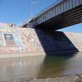
I believe you were trying to capture a semi abstract point of view that showed the detail and character of the bridge. While I can appreciate that point of view, in this case I don't find this photo to be particularily compelling. I'm not sure why exactly but I feel that it is because it just seems ordinary. Not at all bad but it lacks the visual interest. Part of the reason is that it seems to be taken at a distance that only makes me more curious as to what the rest of bridge looks like but I feel frustration that I can't. I do usually enjoy studying a subject very closely when there is a lot of rich texture to enjoy but I'm just not finding a lot of enjoyable textures here. Maybe if you would have done something more interesting with the composition, like taking the photo from a more a extreme angle or waited until the lighting was more dramatic that would have helped give it some punch.
It is executed pretty well with sharp details and natural colors. I do like the complimentary and secondary colors used here, they are pleasing to look at. The values are interesting with the darkness underneath the bridge complimenting the brightness of the columns.
You have plenty of interesting elements to work with here. I just feel that the composition is the weakest area that needs improvement.
Tim |







 Add photograph to your favorites
 Add photographer to your favorites


