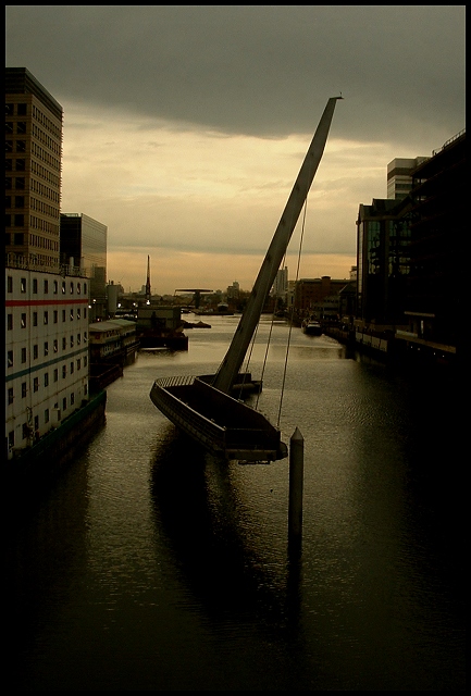
The only place to get this shot from was a train crossing another bridge: I had to do the trip six times to get this right (so don't accuse me of not putting enough effort in!) Also, the windows of the train were really dirty, so I had to get very close to the glass, and the thing was wobbling about like mad - thought I was never going to get it.
It's then cropped, the contrast is increased and the brightness dropped (and it was shot with an exposure compensation of -0.9 anyway) to emphasise the cloud and greyness of the day, and then sharpened to bring up the few highlights (like the handrail).
London Docklands is a bit of a dream for bridge photography, but it can be really tricky getting a decent POV.
Statistics
Place: 69 out of 229 Avg (all users): 5.8782 Avg (commenters): 5.5455 Avg (participants): 5.8550 Avg (non-participants): 5.9242 Views since voting: 1658 Votes: 197 Comments: 13 Favorites: 0
Thanks for that comment, David. The darkness? Well, firstly it was a dark day, and secondly a near-nightmare to get the shot, especially with the lack of control settings on the 2800Z. I like the way the dark surroundings emphasise the patch of brightness on the horizon, the way the darkness conceals some of the messiness of the nearby buildings (mostly still under construction), and along with the reflections in the water serve to isolate the bridge: I could almost ahve titled the shot loneliness, but thought that it needed the help of a little information. I also hoped the highlights on the handrails of the bridge (had to sharpen to get them out that way) would give enough of a clue as to the subject - evidently not a successful strategy for most viewers.
Thanks to all who commented, and of course especially to the five of you responsible for those 10's!
Ed, at first look this photo did not interest me much because it is so dark. The shadows...left, foreground and right looked very un-natural to me and after reading your comments I still do not understand how they look the way they do.
The framing is perfect and takes one's eye directly to the subject(and beyond). Without the title you would wonder what was going on here but using titles is very much a part of photography and you named it well.
The overall colors and tones work really well together. You tuned it beautifully. Dark photos usually do not place well on dpc and to settle on #67 out of 229 you did EXTREMELY well.
You know, after really LOOKING at your picture, dark really works. The light colored building on the left adds to the relaxing feeling I get while enjoying this very nice shot.
I find this photo to be far too dark - maybe it's underexposed, maybe it's just too late in the day, but this photo is so dark it's hard to make out much detail. As such, I'm assuming that crane in the foreground is the subject, but since I really can't see it, it's hard to rate.
The image is too dark, unfortunately, to see what exactly is going on. That's unfortunate, as the detail in the water and the crisp focus make this seem like it could be an excellent photo.
such a cool setup - i hate saying a photo seems to dark but my monitor generally shows them the opposite way so i have to assume that most people are seeing in darker than i am. i like the shadow in the water too.





 Add photograph to your favorites
 Add photographer to your favorites


 Photographer found comment helpful.


