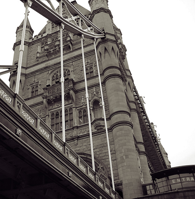
Decided to take a boat trip in my lunch hour from Westminster down to Tower Bridge. Took a load of photos and this one cropped up quite nicely. I Dont expect it to doo too well, but nice sharp lines and an interesting angle make it a bit different..
Statistics
Place: 56 out of 229 Avg (all users): 5.9689 Avg (commenters): 6.7778 Avg (participants): 5.8175 Avg (non-participants): 6.2537 Views since voting: 1414 Votes: 193 Comments: 10 Favorites: 0
My immediate reaction was 'Home'! I lived in London for six years so it was exciting for me to see a photo of Tower Bridge :)
You've chosen a great subject, and you are doing it justice. Tower Bridge is very impressive and the angle that you have chosen is nice. I wonder what your original looked like, if it allows it I would suggest a slightly different crop: Leave a little more room at the top so that the tip of the tower at the front is visible. Crop the right side a bit more to remove the beginnings of the entrance sign. This would achieve a couple of things in my mind: balance the shape of your photo a bit more (at the moment it is squarish but not quite square, and that just feels a bit off when I look at it). It would also remove more white sky (which doesn't add anything to your photo) and the half-legible word (the viewer's eyes are always drawn to writing which in your photo is not the main subject). I do like the angle that you've chosen (not having the tower straight), and I noticed that the voters are divided on it. I think you did well choosing this angle because that avoids the converging lines issue by making non-vertical lines a feature rather than a problem. :)
Was it the sky that made you choose to go b&w (or slightly toned, I think, at least on my monitor here)? Whatever it was, I think the choice is an excellent one. Color photos of Tower Bridge are much more common and your choice of b&w sets your photo apart from the rest.
The tonal range and detail you have achieved in your photo is exemplary, you have everything from pure black to pure white and all the details in the bridge itself are nicely visible, and there are no blown-out or underexposed areas. The white sky is nice and simple and works well, but I still think it wouldn't hurt to see less of it (see my earlier comment above). Everything's nice and sharp, too. Good work.
The photo definitely meets the challenge, the bridge is the obvious (and only) focus of your entry. I like it very much, and overall, the voters did, too. This was a tough challenge with lots of good competition and I think you held up really well with your entry.
I just checked out your portfolio, b&w is obviously a favorite of yours and you do it well. I'm looking forward to seeing more of that from you :)
Please let me know if you have any questions or comments about this review.
What a cool bridge! It seems cropped a little too tight at the top with too much white space to the right - I would love to see a full photo of this bridge, as it looks magnificent. I love the tonal finish and your angle is very original.
Aha, perhaps the most famous bridge of the world.
Basically nice composition, I wonder if I really like the tilt of the towers. I think that getting the horizon straight would show the building leaning forward. Probably caused by using a wideanlge lens (keystoning).
Good detail and sharpness.
Big grin - she's very photogenic, Tower Bridge, isn't she? I took a shot something like this myself, and didn't enter it for the same reason I'm unsure about your shot - it just doesn't quite give the impression/impact the bridge actually has: I found it a really difficult subject (perhaps because so well known), and so went and shot something else :-) Good try though (better than mine was, anyway).





 Add photograph to your favorites
 Add photographer to your favorites

 Photographer found comment helpful.


