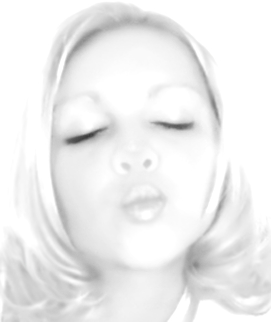
Interesting image treatment, but I find that the way the outside of her nose fades into white puts too much emphasis on her nostrils. Her eyes, nose and lips need to be sharper yo alleviate this I think.
I love the look of it, even though you are probably getting alot of.."not high key" comments. Looks like the high key sketch action I worked up. guess that is why I lke it so.
while I can appresiate a good High key shot. I feel that this one is slightly out of focus and a bit too washed out. This was a wonderfull concept but I think that you lost too much in going hight key.
For me personally, this is just too high key. You need a tad more shadow on the nose area to give it some more shape. The nostrils end up just dominating the center of the image. I'm pretty sure that wasn't the goal. :) Interesting idea, trying to replicate a Marylyn Monoroe shot. Might be fun to try again, but paint in some red on the lips?
very dreamy. nice composition. this probably won't score as well as you'd like, but all the same, i'm sure this image represents the result you intended, regardless of scoring. good work!
I'm sorry, can't quite see what you are trying for here - too soft and overexposed, although I suspect that is what you were looking for. Different lighting needed somehow.
Cute composition however not sure I like how you have exposed the image. Would have probably voted higher with the original colour entry or simple B&W conversion...Seems overdone. Good Luck.
I usually like high-key shots.. for me, this one lacks definition. It seems like it still needs some "hard lines" to finish it off. One thing, for example, is her nose. Without any "lines" to show her nose, it almost looks like a pig nose (a snout with holes in front). It's lacking the "3-d" clues that would have convinced my eye otherwise.






 Add photograph to your favorites
 Add photographer to your favorites


 Photographer found comment helpful.


