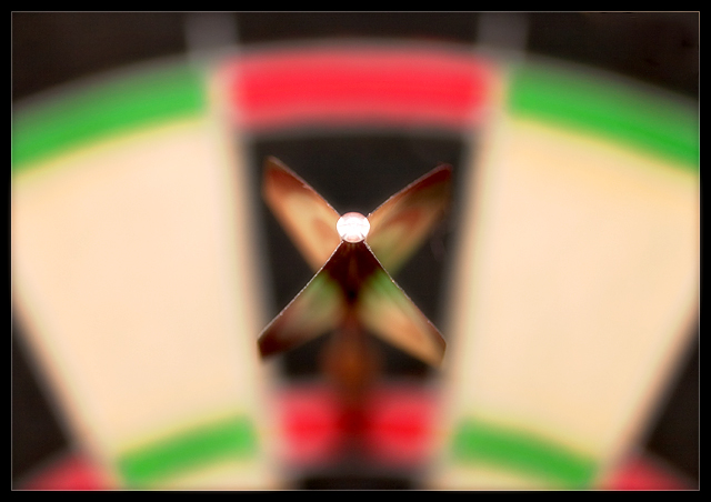
First impression: wow fuzzy... oh ok it's for the brokeh challenge.
Does it fit the challenge: yes it does fit the challenge it is without a doubt brokeh. However I feel that part of what may have hurt the score for this picture is that the brokeh does not enhance the image IMO. The Center of intrest the rear of the dart does nor have enough detain by itself to keep me interested.
Title: Treble 20.. I have no clue what this means. So I am unable to form a relationship between the title and the look of the photo.
Lighting: From what details I can make out the lighting looks to be good There are no harsh shadows or blown out areas.
Focus: While your shallow DOF did give you the brokeh for the challenge I feel that you may have went to shallow. Perhaps allowing the viewer to see more of the dart and maybe the fins leaving the board in brokeh would have been more interesting.
General Overview: While I like and enjoy alot of this shot. Such as I like the rich colors. I think the proportions were done well, and I realy like what I see as the concept you were aiming for. I would not have voted this above a four because it still apears to an out of focus picture to me. I can see where this is easily a love or hate shot. It will come down to a matter of personal opinion. Is it out of focus with a shallow DOF. Or is it a creative use of brokeh.
I wish I could have written you glowing review. But I assume that by submmitting for a C.C. critiqueyou would rather have an honest opinion. I do however enjoy alot of yopur other work. Even if this isn't one of my personal favorites of yours, I hope to see what wild and interesting shot you come up with next.
I LOVE this shot. I think it might work a bit better if the dart were more off center, although I do like the symmetry of it as-is. You did a great job of getting the colored bars to perfectly aligned. If this one doesn't place highly, it's a crime!
I think the idea on this is great! - The colours and shapes in the out of focus area are absolutely key to communicating what it is that we are looking at. There are a few reasons this doesn't score highly with me though and they are generally down to personal taste, though that's the case for all my votes! Firstly I just don't like the luminous colours on this board. I wonder if a traditionally coloured darts board might have appealed to me more? Secondly I am not hugely keen on the centred composition though it is nicely done. Thirdly I feel that the key part of the dart is the pointed tip not the flight so I'm not so keen on having that part of the dart fall into the out of focus area.
I scored this a 5.
Now this is exactly what I thought this challenge was all about. Yes, there are some pictures with very nice and pleasing bokeh but this is the first one I see where the bokeh actually enhances the subject. It's actually framed but the bokeh. Excellent job.







 Add photograph to your favorites
 Add photographer to your favorites

 Photographer found comment helpful.


