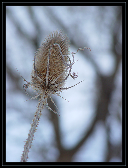
I really like this one. I like the blurred background, and the sharp focus of the thistle. Lighting in situations like this can be very challenging, and i'd have loved to see a bit more light on the subject itself. Having said that, your lighting choices did not detract anything. Someone commented that your photo was "not well centered".
Well, GOOD! I espically like the positioning here. I like the subject on the left, and the big black splotch on the right. It lends a subtle balance.
All in all, I think you were ripped off, by at least .25, if not a full half a point or more.
This dark border makes it like looking through a window from the inside. A lighter or no border at all would allow the viewer to wander more and imagine the surroundings where its eye is lead and give a greater sense of space to the composition.
Nice shot! I like the grey tone and the placement of the subject. I really like the background it gives it a dreary feel which makes the title perfect for the photo.







 Add photograph to your favorites
 Add photographer to your favorites

 Photographer found comment helpful.


