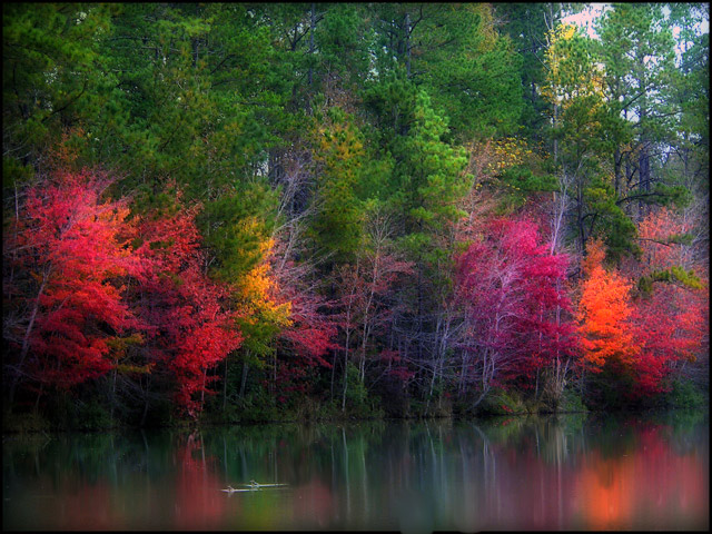
The colors are stunning!!! I love the soft feel. I wonder if cropping the top off 1/8th or so, just above the lightest green tree in the center, would help. The brightness of the sky draws my eye away from the main attraction. Overall, gorgeous photo, would have given it a 7 or 8 :)
This is beautiful. Nice bright colors and soft reflections.. just one thing, I think you could have benefited from a slightly lower angle. That doesn't mean to say that I don't think its an awesome picture though =]
I obviously hadn't checked out your Profile very closely, because you have some beautiful shots! This one among them. Was this taken in GA? And how much did you "add" to the color sat? REALLY nice reflection and a super job.
This is a stunning shot and got lots of useful comments. It's an attractive scene that was enhanced with some sure handed post processing. You got the balance right here. If I have any suggestions for improvement it would be to try and bring back some of the detail in that very orange bush on the right. No other comments. Well done. This is a 9 from me.
Nice scoring shot and I can see why. I gave you a 7 during the challenge for this one. Some folks might think those colors are oversaturated, but I happen to really like it that way. It would make a beautiful print, as it feels very artsy to me. The reflections are awesome. The only thing I would change, and you really have little control over, is the lighting. It appears to be just a little flat. Everything else is so nice, that it's not something I'd notice right away, however. It might look a little livelier with some dodging of the upper trees just a bit. Hope this is helpful!
Thanks to everyone that voted and a special thanks to all that commented. This is my highest score todate and learned a lot from the comments you posted.
Looks too saturated for my tastes. Colors don't seem 'real'. You also appear to be blown out in a couple of spots. Like the soft focus effect though!
TC
what a gorgeous capture. those colors are simply beautiful. i wouldn't worry too much about the softness, as that helps bring out the overall peacefulness of the image. good work. i hope this isn't being overlooked in this huge challenge, and that you are getting some good feedback. good luck here, and in the challenges yet to come!
Very impressionistic - that one bush that has turned flurescene orange with the processing is a little offputting, but besides that this is very effective.
I find there is too much saturation in this photo for my liking. The colors looks flourescent and not natural. Did you use a soft-filter for this? Overall, the effect is good .6
I've seen this. SDW65. You've really punched up the vibrancy of this shot (the orange almost seems too bright though). I love the ducks infront. Nice composition.
Love it. Some will complain of too much saturation but the muted colours balance out the vivid ones. The smooth texture of the lake balances out the deep textures of the trees. Very nice image. You should be proud.
this is gorgeous! Where was this taken? It looks like an impressionist painting. I love how the reflection is blurred as if the canvas was smudged. The detail seems to get sharper as it gets closer to the top of the photo. Very nice.
I remember looking at his pic before I was going to comment but I never did. I dont think. Guess I can now. I really like it. The only thing I would have to nit pick at is the orange tree on the right of the shot it is a little too bright for me and you lose some of the details of the leaves. Nice shot.





 Add photograph to your favorites
 Add photographer to your favorites

 Photographer found comment helpful.


