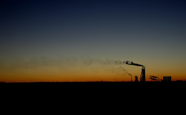
This photo isn't my favourite of 2004, it's more of an homage to this site because it reminds me of my highest scoring photo so far.
I joined dpc in August of 2004 and have learned so much here...and more from the forums and private messages from users than from the challenges. It's funny, it seems like the "c" in dpc should stand for community as the challenges are more of an extra for me.
Thank you to everyone who takes the time to vote.
This one was a simple post-process...adjust levels, boost saturation and contrast, then neat image.
Cheers and happy new year!
Statistics
Place: 450 out of 530 Avg (all users): 4.9114 Avg (commenters): 5.7500 Avg (participants): 4.9019 Avg (non-participants): 4.9412 Views since voting: 908 Views during voting: 485 Votes: 350 Comments: 8 Favorites: 0
Great composition and subject matter. Lighting and detail are good, rich in color without being over-saturated. A little more contrast may help this (if you want to go dabble a little later) ((8))
Image is very dark and dull (colour) for my liking. I do like the simplicity of the image, just wish you used a longer exposure or adjusted the levels a bit to bring out more of the sky.
i love the sheer simplicity of this image. great work! i hope that it is getting the attention that it deserves, and that it is not being overlooked in this vast challenge. good luck here, and in the challenges yet to come!
I wonder if this photo will suffer from "poor voter monitor calibration syndrome". It appears dark to me, and hard to make out what the little things are - factories far far away? and the rest is grass? I will come back to this tomorrow at work where the monitor is much better.
Good silhouette shot - the way the smoke plume trails accross the whole image is very effective. I don't know if my eyes are playing tricks on me but that horizon seems a little tilted - that distracts me a bit. 7.






 Add photograph to your favorites
 Add photographer to your favorites


 Photographer found comment helpful.


