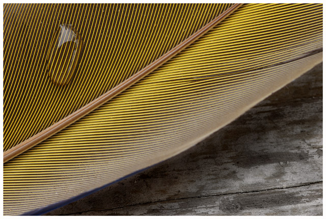
This is a great photo, but there is something unbalanced about it.... I'm not exactly sure what it is. Perhaps it is the contrast between the strong yellow color versus the strong lack of color in the bottom right.
Strong graphic image. The composition might be a little on the obvious side, for me - although the grain of the wood seems to run at a pretty arbitrary angle to the grain of the feather. Very pretty.
I like this shot, however I find the bottom right takes away from this image. not sure if you are restricted by the size of the subject, but would have preferred not to see the wood. Good luck.
i really hope this does well! i tried to do this a while back, but just couldn't get it. i don't think most people realize just how difficult this shot is. you've inspired me to try again--thanks! good luck! (this is going in my faves now)
Very lovely. I especially like the way the yellow & black lines terminate in the white frame - cool! Would prefer the background to be burned darker, I think. ...8...
I'm a sucker for textures and I particularly like the contrast between the rigid, repetitive feather and the worn and faded surface beneath. The composition, with the two sweeping lines of feather quill and edge, is punctuated perfectly by the water droplet. Yellow is also one of my favourite colours. Altogether a beautiful shot. 9
I really love this one. Pure and simple, Enhanced by the single flaw in the feather, the whole feather balanced just so on the monochrome of the board, the reflection in the droplet critical but not overstated.






 Add photograph to your favorites
 Add photographer to your favorites


 Photographer found comment helpful.


