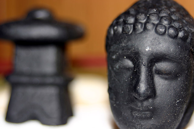
I don't think there is enough focus on the right. You can't see the eyes which kinda makes it look awkward. NIce job w/ the dof, but I don't really like the composition.
Your subject has potential. Because the 2 items are separated by so much non-descript space the don't have a strong compositional relationship to each other. And, though you've cropped out most of the harsh shadows beneath the head, it seems that adding another light source would help. The background and shallow depth of field is on the right track, but lack of a sharp focal point hurts the overall effect.
This image does not say much to me. The lighting doesn't seem interesting, there is dust and blemishes all over the statue's face, and the DOF seems a little narrow. I do like how you've combined the face infront with the tower (?) behind.
Unfortunately, this is nothing special compared to some of the other shots in this contest. Suspect this will be voted low. Cropped to closely for my liking and don't like how much of the image the out of focus background object (temple) has. Sorry. Good Luck.






 Add photograph to your favorites
 Add photographer to your favorites


 Photographer found comment helpful.


