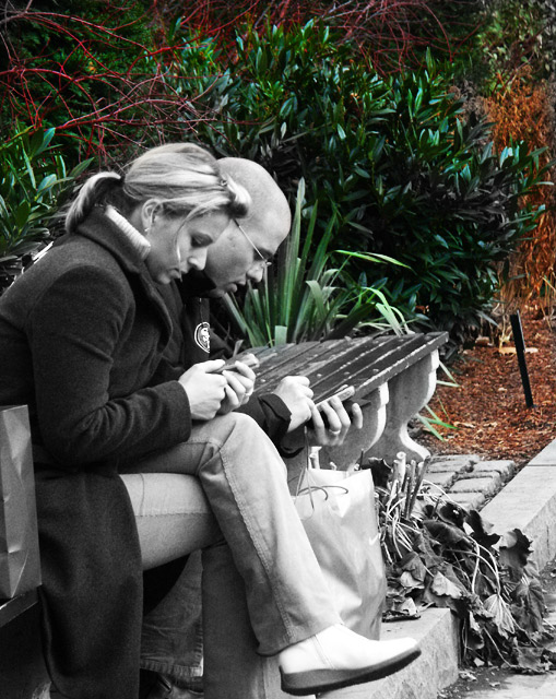
Nice captue, but I don't understand the desat. Why? OK, it kinda directs your attention to the ppl, but you're gonna fix on them anyway. And this desat gives the photo a unrealistic feel, just like the BG was pasted in in PS.
Good title.
Wow this could have been a great photo. A comment on modern communication, both people iming or text messaging or whatever, but no live sommunication. As cold as the weather that killed the plant hanging into the gutter. If this were a mono image, I'd score it at least 8. A color image a strong 8. As is, it is confusing and loses a great deal of its power. in my opinion, at least.
Not really sure selective desat works here. Usually, its used to draw your attention to the main subject by leaving it colored. Instead, you've uncolored the main subject, thus dividing my interests. My eyes keep going back and forth between the people and the colored foilage. Probably would've looked better completely B&W. Though, that leaf thing near his bag sort of bothers me too.
It appears you took care in your desaturation treatment of this image. There is a spot behind the woman that you missed however. I think the larger issue is your choice of desaturation. Does it enhance the message or overall feel you are trying to convey? Or is it merely an exercise for the sake of doing it? In any event, I feel that a better choice would have been to reverse the desaturation so that your subject becomes the highlight.
I am actually a fan of selective desat, but I don't understand it on this image. The colors really draw you away from the subjects. I think that its a well composed shot. Maybe all b&W would have helped. Mahalo 5
Not a fan of the selective color desaturation in this picture. The shot is great but would be much more effective and emotional in one or the other. The b&w seems unmotivated and random. Maybe you have some artistic vision that I'm not seeing, but thats just how I feel. Nice capture...just be careful in post.
Somehow, desaturating the main subject(s) doesn't work for me here... I'm more drawn to the background, and that takes away from the shot IMO. As a suggestion, I'd have gone with a shallower DOF and left the colour intact. Still, fits the challenge well.






 Add photograph to your favorites
 Add photographer to your favorites


