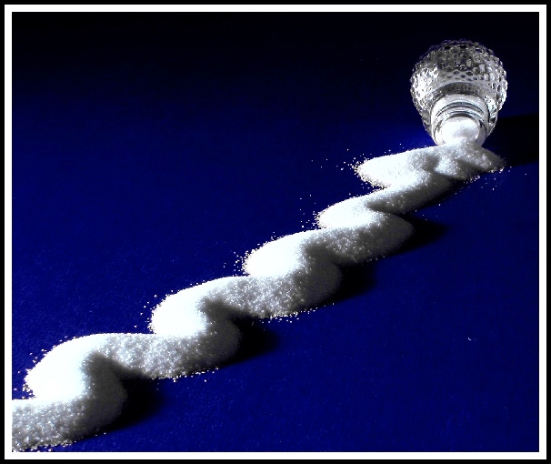
Let's see. I placed some SUGAR on a piece of RED cardboard and placed the little salt shaker at the end of the line. I changed the red into blue using Paint Shop Pro (in hue/saturation). Also played with the histogram adjustment for brightness/contrast. Sharpened once. The left side of the sugar is a bit washed out ... I should have under-exposed the shot, then brighten it up. Ah well, had fun shooting it.
I hope it meets the challenge. I have to admit I don't quite understand leading lines.
Statistics
Place: 4 out of 74 Avg (all users): 7.1765 Avg (commenters): 8.4800 Avg (participants): 7.0806 Avg (non-participants): 7.3250 Views since voting: 4325 Votes: 102 Comments: 35 Favorites: 3 (view)
Composition - Obvious the line of sugar is our leading line. When I think of leading lines I think more of scenic places that end with "scape", but lines are lines. What I see as the most effective thing in terms of the composition is how you somehow made the sugar really contrast with very effective lighting. The left side is total white out and the right side has parts where its almost completely black. This is really an extraordinary line. But looking at it, it seems so simple but I would never in a million years be doing this, on purpose and make it so effective. I think if you would've lost the little white thingy in the bottom right corner you'd have earned yourself another ribbon. Your creativity is unbounded!
Technical - Perfect exposure. "Crystal" clear, great color (artificial or not)with an awesome gradient type background. Darn near perfect. 'nuff said!
Overall - Tremendous shot. A strong second in my book. (I really think the winning shot is deserving). Love the picture though. Your creativity is really in a class by itself Jacko. And the other part that goes with it is that you know how to put it in print effectively. Great Job! - Bob
Excellent idea for this challenge. The shadows on the salt really create a lovely wavey effect whilst the salt in that motion is quite unique. I love the blue background colour as well. Very creative idea, well done. GL.
Although I think the highlights are a bit harsh, the compression is a bit too radical and that white dot in the bottom right is disturbing, this is getting a 10. One of the few pics that really lived up to the challenge this week. Good job.
Hmmmmm this smells like a Rackat photo but I can't be sure ;-) The attention to detail makes this otherwise simple shot work! A little over-ex on the salt. The angle adds depth and you respected the theme. The colors are great!
Very crisp. I like the curviness of your leading line. It is more interesting than if you had used just a straight line. The white against the blue really helps it stand out. One of my top 3 picks this week. Good shot.





 Add photograph to your favorites
 Add photographer to your favorites


 Photographer found comment helpful.


