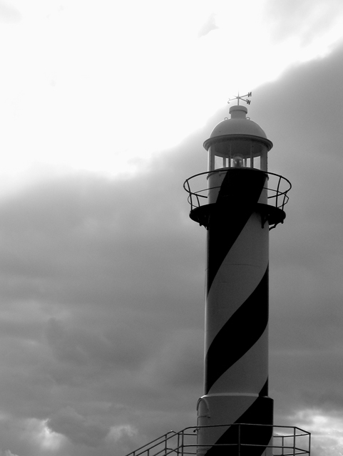
while i appreciate you effort here, i think your image could use some work. the bottom half is nice and tight, but the top is completely blown out. if it is on purpose, i'll admit, i'm not getting it. if this is not intentional, then please don't take it personally if you are not getting the scores and comments you expected. this is a tough challenge, especially in its size, and to do well, you need to connect with the viewers both technically and aesthetically. good luck!
I think this photo may suffer a bit from people with smaller moniters. I find it to be unnecessarily to tall and a 1 inch crop off the top would have had the same impact. I like the B&W style and the way the contrast from the sun whites out the weather vain on the top. It also has excellent clarity and good use of ROT. Well done and keep up the good work in 2005.







 Add photograph to your favorites
 Add photographer to your favorites


 Photographer found comment helpful.


